Which White is Right?
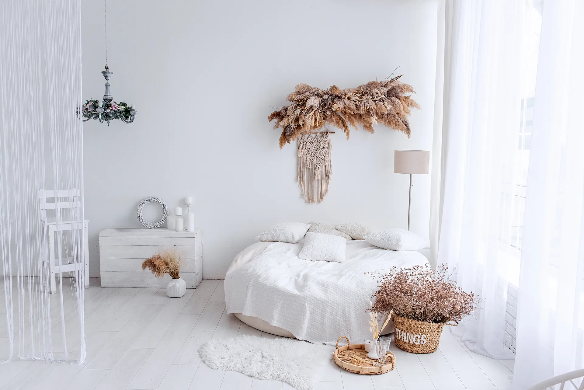
Sometimes a nice airy white is just what the doctor ordered. From Airbnbs, modern homes to sandy beach houses, it’s okay to want a neutral base for your art and furniture to really pop. But with a plethora of names like Sea Salt, Powder and Bermuda Sand how do you know which is the one? You don’t want to end up wearing sunglasses indoors but equally you don’t want it to look dated. Consider the following a good start to finding the right white…
What is an Undertone?
No white is just pure white pigment. It has been blended with a sprinkling of yellow, blue, green, pink or grey that can change the feel of a room. This is called the undertone. If you want a clean, crisp look, whites with blue or gray undertones are ideal. If you are aiming for a more classic, warm look try a white with a yellow, cream, or beige undertone. This provides a softer, more traditional feel.
Top tip: When looking at swatch charts, cast your eyes to the darker swatches on each palette to understand clearly if an undertone is more cool or warm.
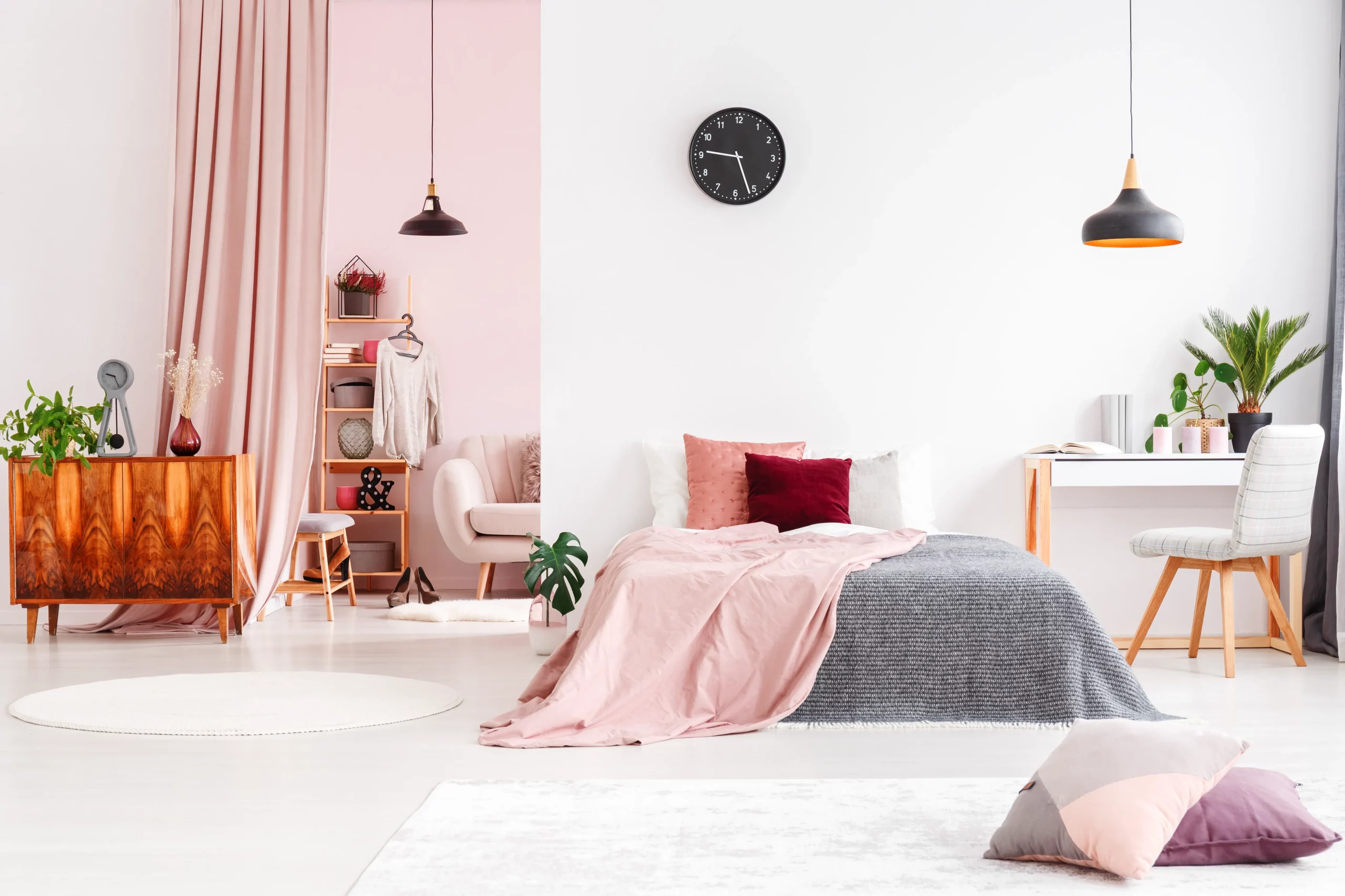
Consider the Light
Is the room bright or does it only get a sliver of afternoon light? Do you use it more during the day or at night under downlights? If there is no direct light coming in, opt for a warm shade of white with a creamy undertone (hints of orange, red or yellow). The cool light in the room will cancel out the warmth of your paint colour, making it look clean and crisp. If you have a lot of warm natural light coming in and the windows mostly face north or west, opt for cool shades with a grey, blue or green undertone. This will help cancel out any glare coming in and the warm light in your room will neutralise the cool undertones of your white paint, making it look balanced.
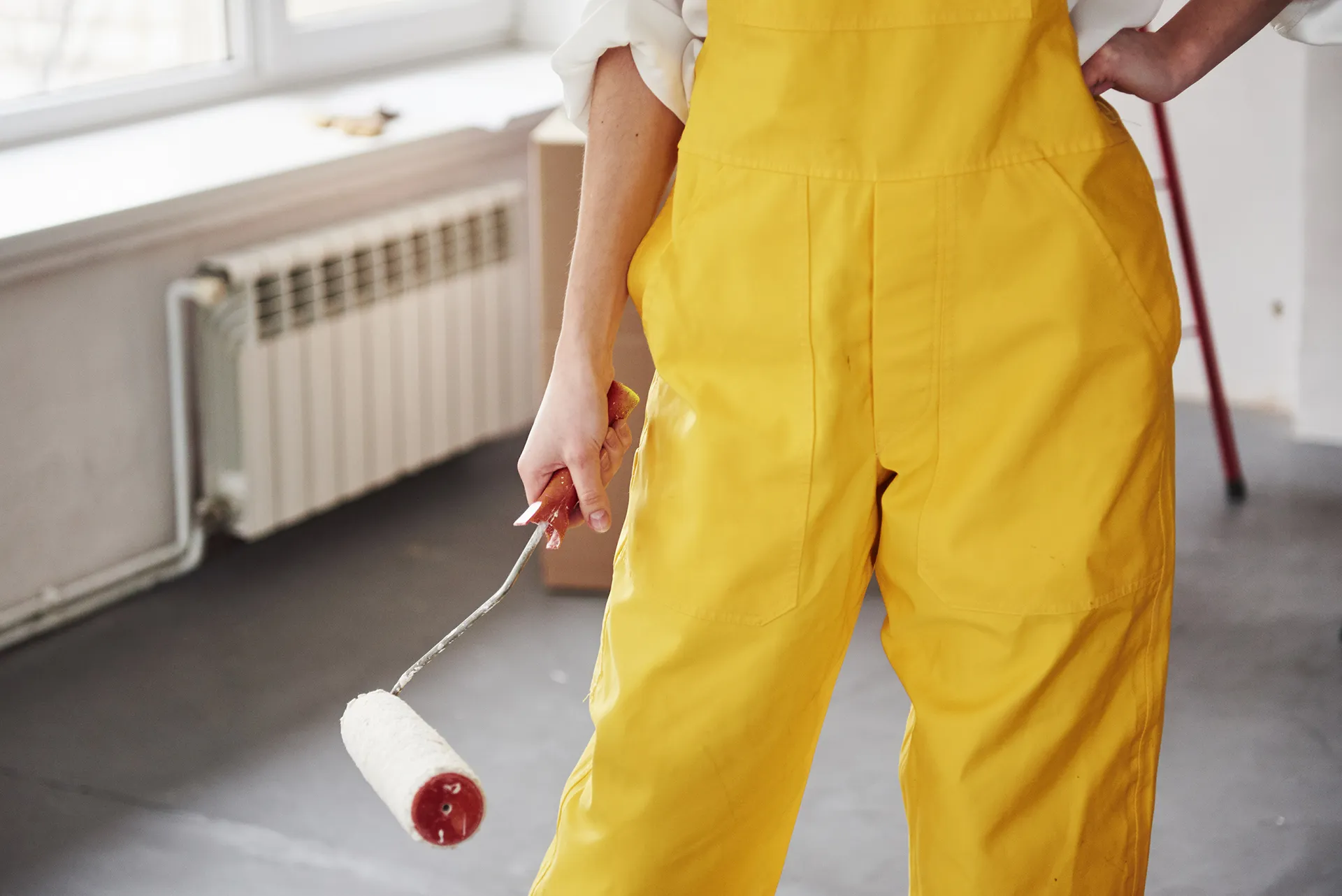
Test like a Scientist
Paint 1m x 1m colour blocks when testing shades. Background colours could make the swatches misleading and small strokes next to each other can bleed into each other visually so you won’t get a true sense of how the shade will actually look on its own. Be sure to layer up, one coat is not enough to really know how a colour will look. Also compare what the changing light does to the test swatches. A bit like a wedding dress, sometimes what you thought you wanted isn’t what you like in the end.
Artificial Light
Just like natural light, artificial lighting can affect how colours appear. Halogen and incandescent bulbs emit yellow light, which make wall colours feel warmer, while energy-saving bulbs tend to give off a bluer hue, giving paint a cooler cast. For the truest representation of your chosen wall colour, you may want to try a neutral white bulb, which most accurately replicates daylight and then start your colour search.
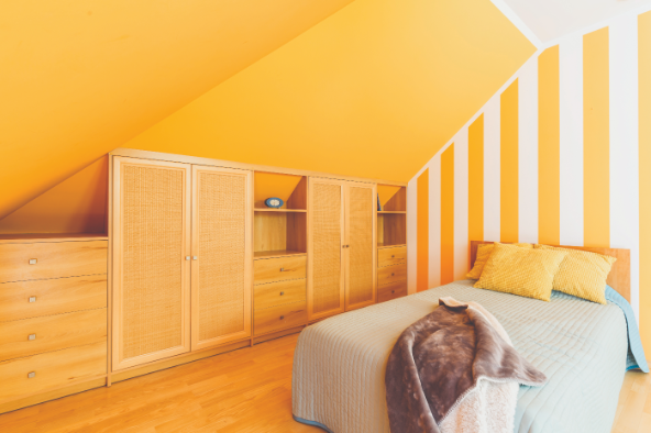
Furniture Plays a Factor
Think about what furniture, rugs and even the floor of the space is going to be. If the decor has warmer tones like antique wood – a white with beige or yellow undertones will complement it well. For a more modern aesthetic with sleek furniture and cool-toned concrete or marble; whites with gray or blue undertones will blend seamlessly. Your white paint should act as a backdrop that enhances and complements your existing decor, not clashes with it.
The Joy of VibrAInt
Still at a loss? Make your life easy with VibrAInt, Olympic’s AI colour tool. Simply select the room, the level of light it receives and the mood you wish to create. VibrAInt will showcase Olympic’s paint colours in different rooms to give you a real-world view of how they would look in the room of your choice.